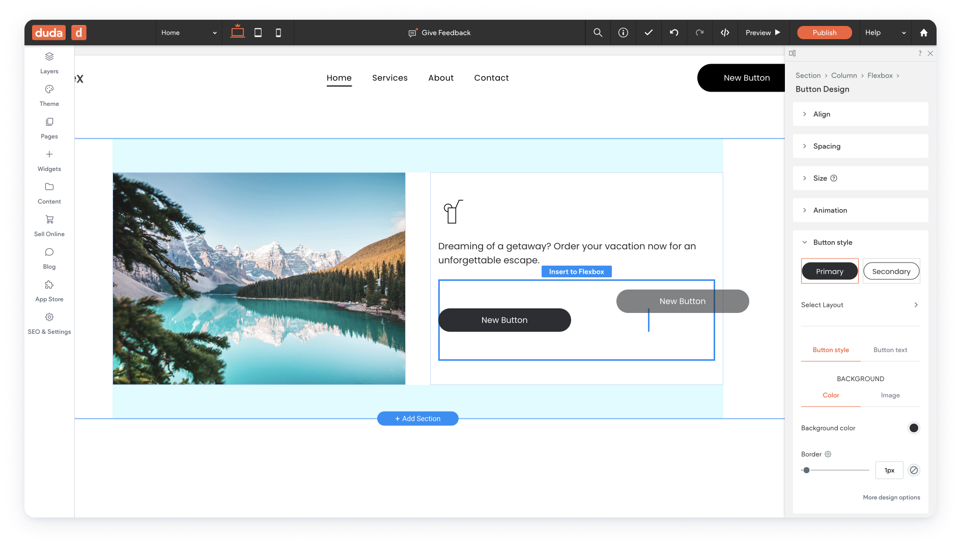
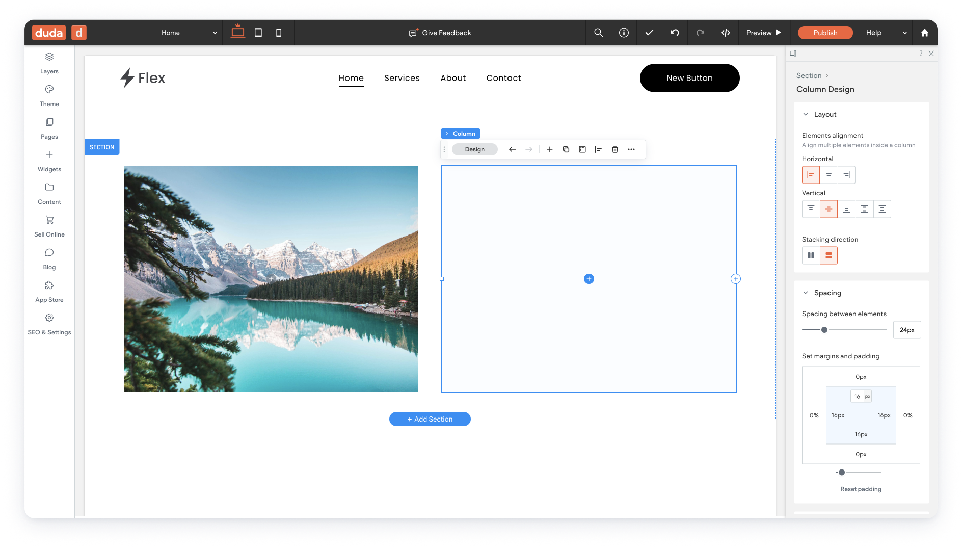
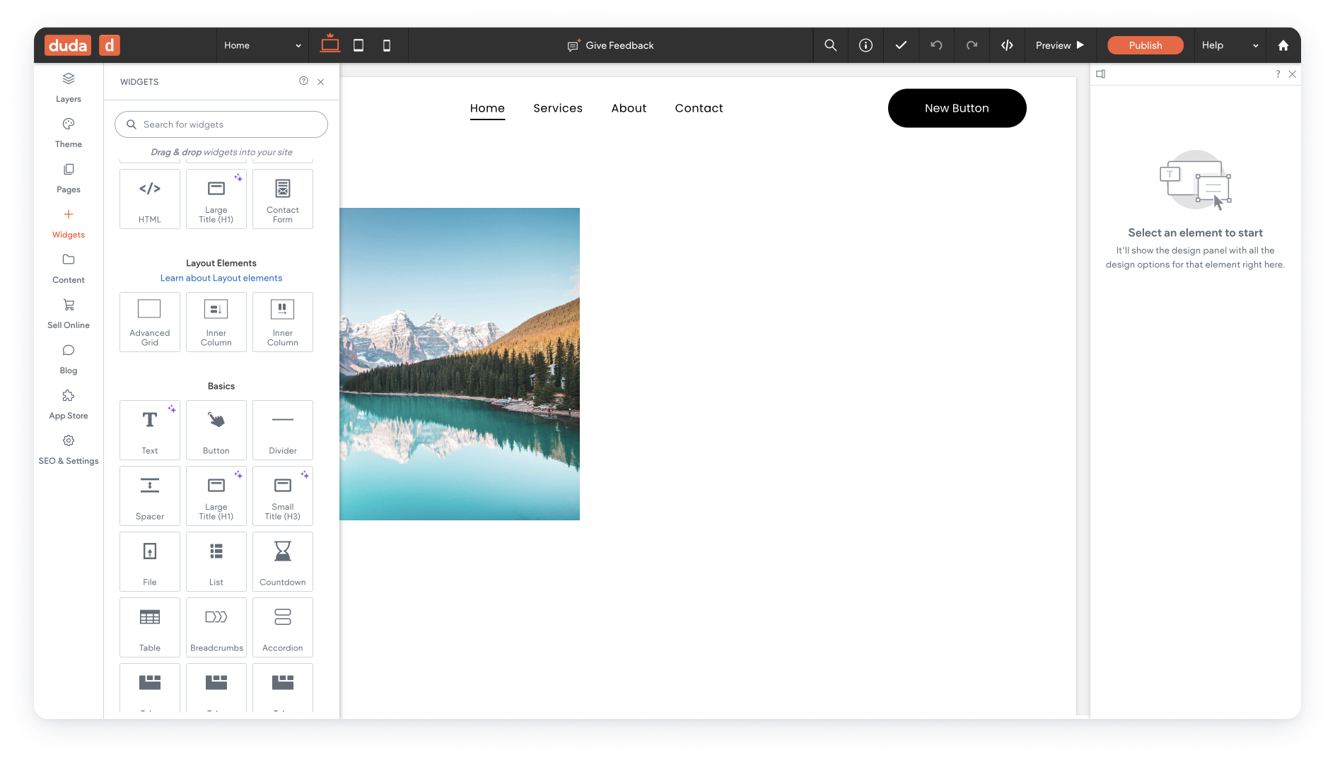
From Grid to Flexbox
When Duda first lounged the Flex section, it was based on a grid technology. Shortly after joining Duda, performing many user tests, and watching a bunch of full story sessions, we decided to update the structure of the Flex section to be based on a Flexbox mechanism.
This project shows the progress from research to release.
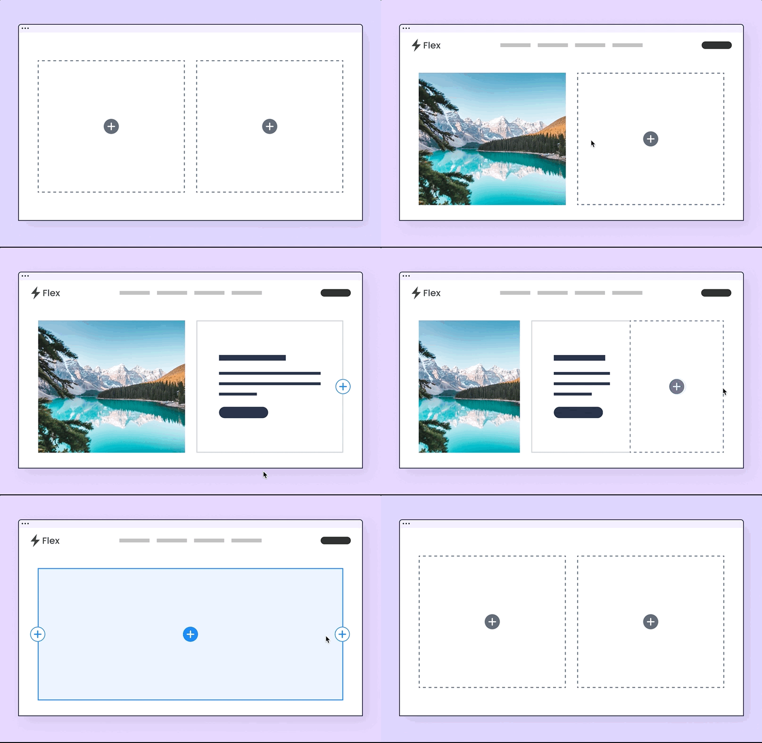
Gif made using Figma prototyping | Quicktime | iMovie editing | Giphy recorder
My Role
UX research
Usability
User interviews
Competitors analysis
Wireframing
UI design
Editor design system (partly)
Tools
Figma
Miro
Notion
Mixpanel
Domo
Fullstory
Illustrator
Collaborations
I worked closely with our product manager to understand the project's business goals and scope.
I brainstormed with our development team to search for the most suitable, user friendly, and simple to implement solutions.
year
2020-2023
Why?
Why Does Duda Need a New Editor?
Performance
Maintenance
More design flexibility
Why Move From Grid to Flexbox?
Although the grid-based structure gave extreme design flexibility, the basic site building flow was not intuitive; our support team received many tickets related to the grid design experience, negative feedback was received frequently, and the adoption rate was low.
User Journey
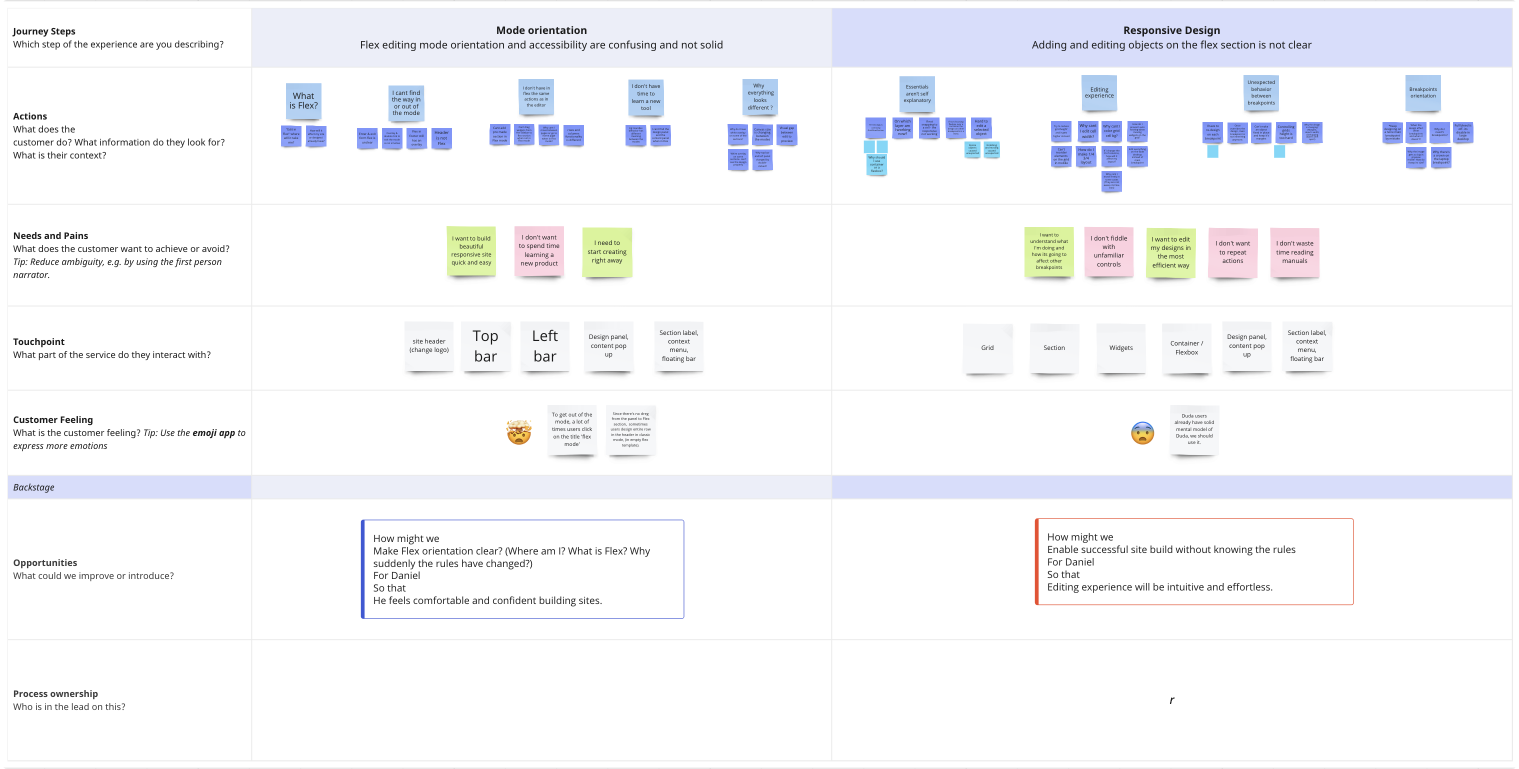
We Mapped the user’s steps to create a site and the main pain points they met on their journey.
We highlighted the most repetitive pain points so that we could focus on the main ones.
Then, we had a workshop that included stakeholders, developers, product, and UX to help us brainstorm and get a high-level solution to the pain points we found.
Main issues
Mode Orientation
Flex editing mode orientation and accessibility are confusing and not solid
What is Flex?
How will it affect my site?
Why suddenly everything looks different?
I don’t have time to learn new behaviors
I can’t find the way in or out of the mode
Why cant I make basic actions from Flex?
How might we
Make users work according to correct responsive principles without having to understand them.
For
Daniel (new user)
So that
The editing experience will be intuitive and effortless.
Responsive Design
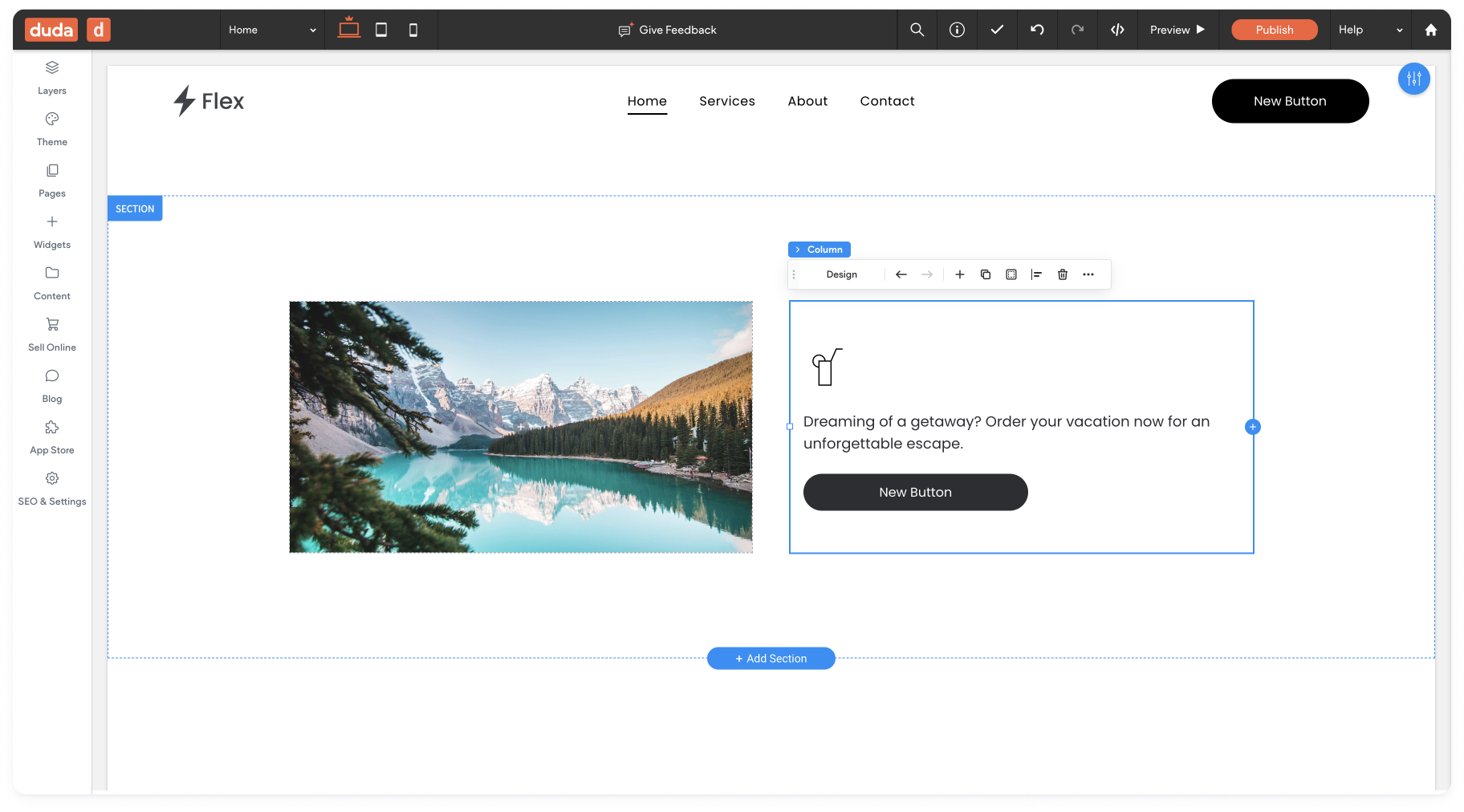
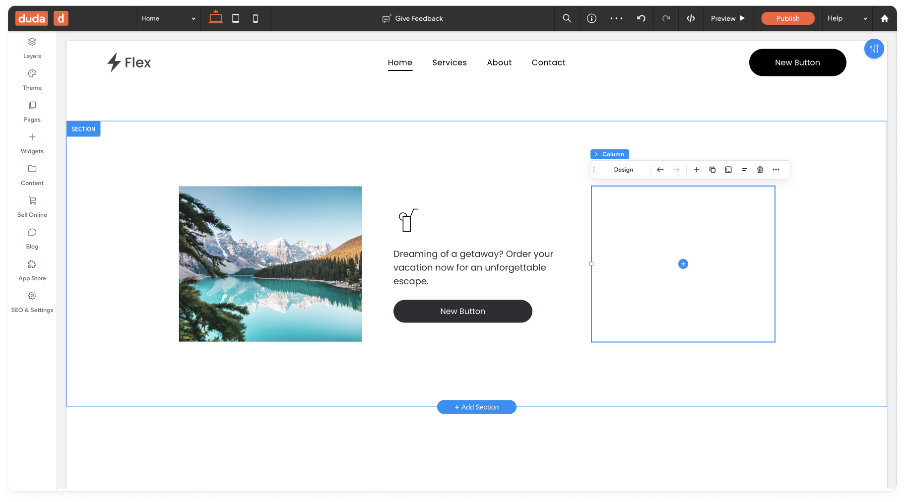
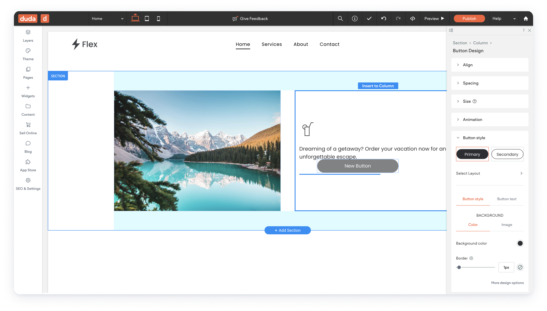
Adding and editing objects in the Flex section is not clear
Essentials aren’t self-explanatory
Editing experience is not intuitive
Unexpected behavior between breakpoints
Lack of orientation when switching between Breakpoints
How might we
Make users work according to correct responsive principles without having to understand them.
For
Daniel (new user)
So that
The editing experience will be intuitive and effortless.
Responsive Design Solution
After analyzing our competitors’ solutions, our user’s sites, and general site building blocks, we decided to fit the building process into best practices & defaults.
Although we know our users want and need high design flexibility, the ability to create simple and basic sites quickly and intuitively is crucial.
Most sites are built as lists: Items arranged one below the other, next to other lists, above/below other lists, and so on.
We already had a Flex-box structure for inner elements. Using this structure as the default building block of the editor saved us an expensive dev effort, and it is also familiar to existing Duda users.
We kept the advanced grid as an elementusers can add to create complex layouts (e.g, overlapped elements).
'There is absolutely no reason to build a non-flex site ever again.'
Matt Villnave | Editor 2.0 Q&A webinar chat
'That is an entire conversation that's avoided. And just using Flex is a lot more intuitive.'
Vedha | Zuddl | Link to snippet
'Within the field of website development, Duda’s Flex 2.0 [Editor 2.0] possesses an incredible amount of potential to revolutionize the process..'
FlexPixel agency | Link to post

