Management Interface
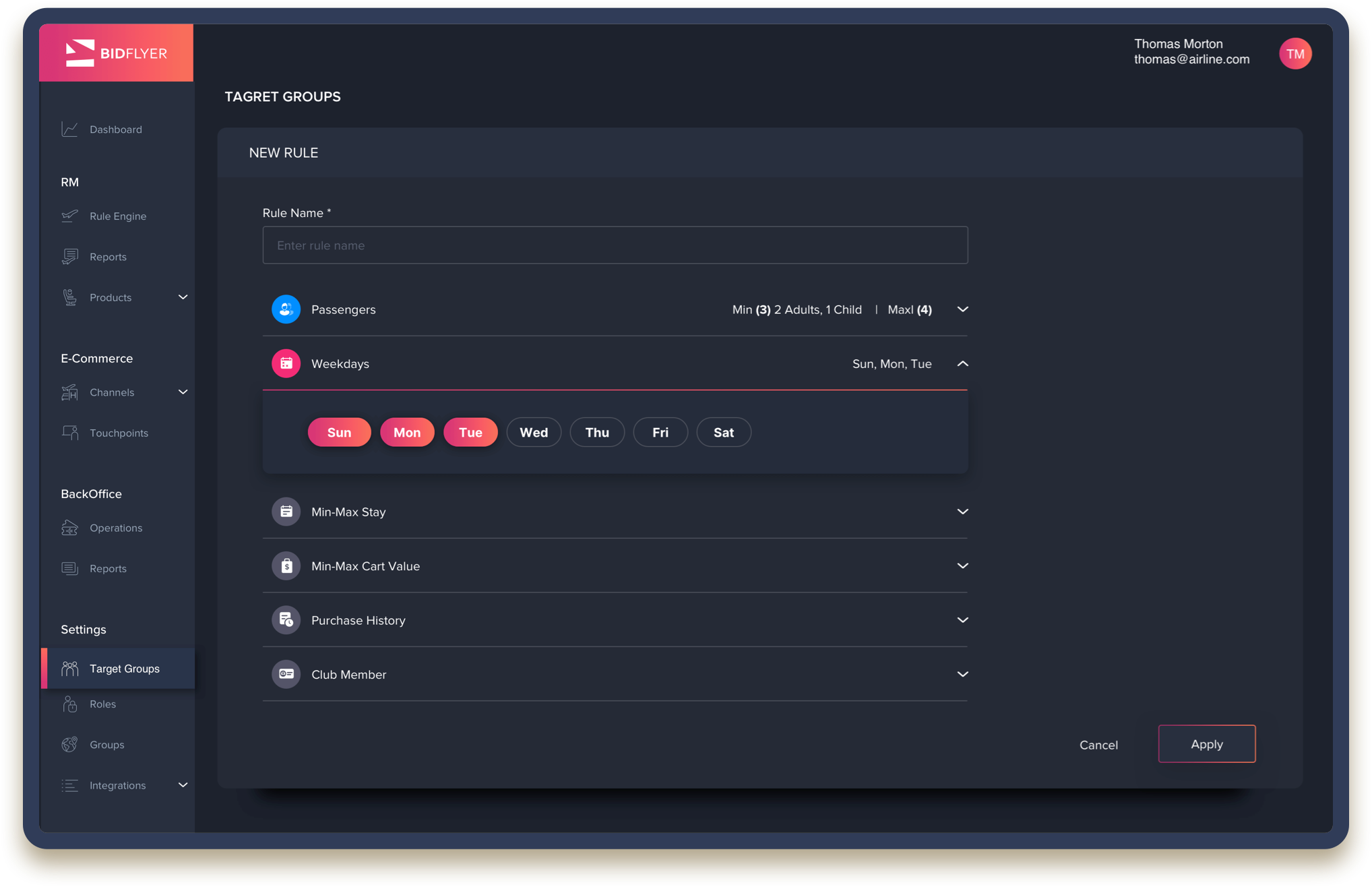
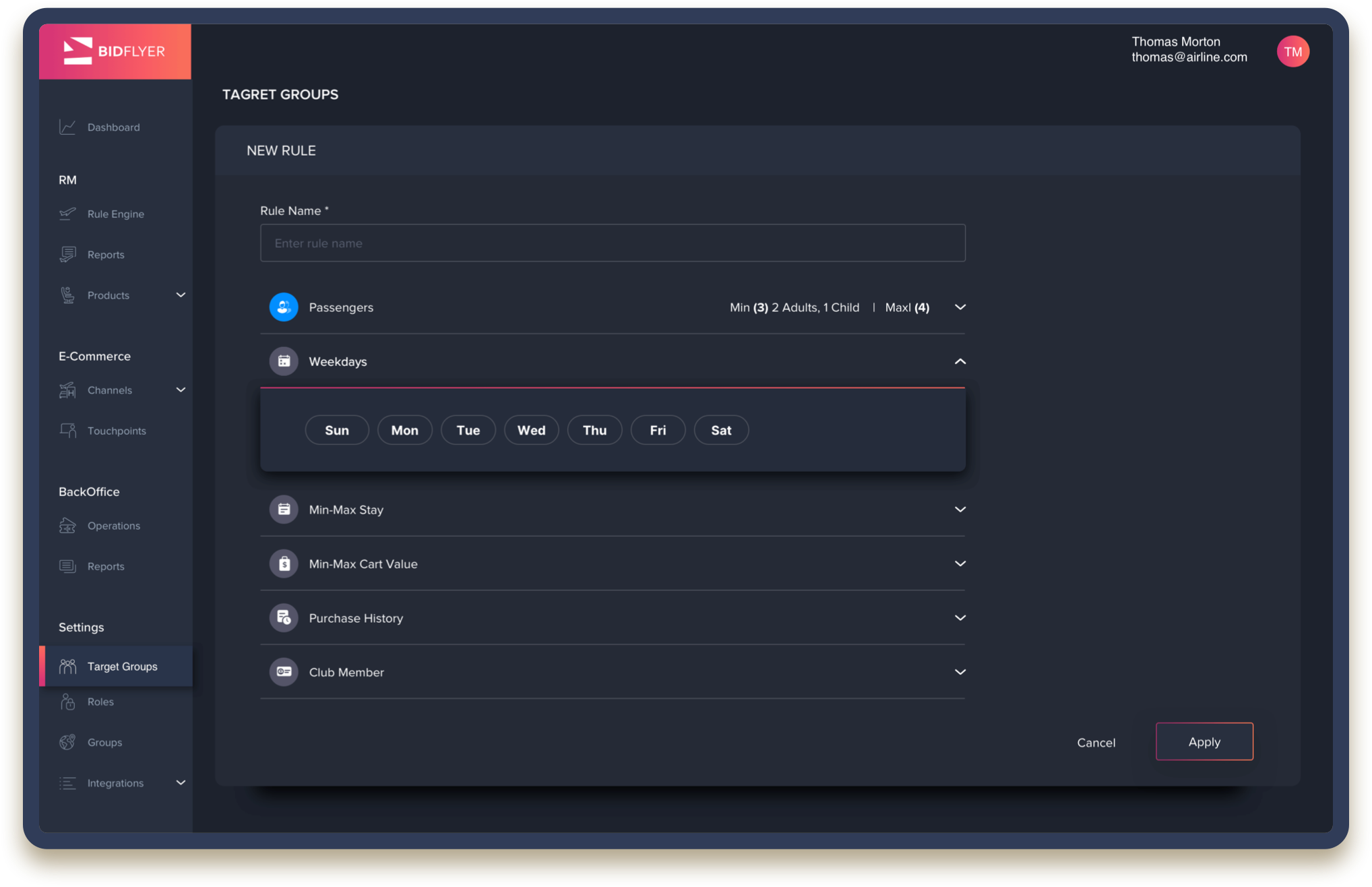
This project is a small part of Bidflyer’s management interface. I was responsible for all ‘Settings’ section, such as the ‘Target Group Settings’, which allows Revenue Management (RM) admins to define target groups based on users' data.

My Role
UX research
Sketches
Wireframes
Design of settings' components
Icons
Tools
Sketch
Illustrator
Axure
Invision
Zeplin
Collaborations
I worked closely with our product team and CEO to better understand the business behind the scenes and create the most valuable and effective tools.
Together with our development team, I carried out brainstorming, flow clarifications, QA, etc.
year
2019-2020

After Effects component animation was created by me
Understanding The Business
Bidflyer is a B2B2C company, which promotes revenue optimization by supplying airlines with a full retail platform, using technological solutions. Our primary and most important feature was the new management tool. This tool enables key figures in the organization to set "rules". According to these "rules", the system will offer users a tailor-made price/product. The main goal of our technology is to help airlines "rescue" abandoned users or to encourage users to adopt additional upsell opportunities, thus maximizing profits and controlling flight inventory. Bidflyer's system uses the user's data as well as the airline's inventory analysis to optimize revenue management.

Bidflyer’s FRM, designed by me for 2019's Executive Summary
The User
The primary user for this feature is the airline's RM team, which manages corporate strategy for scheduling, product and pricing.
As an important part of their operation, RM admins define target groups according to the end user's travelling habits. For example: A man who travels alone, at the middle of the week for one-two nights, and purchased his ticket one week ahead of his flight will be targeted and classified as a businessman. We wanted to give these teams the ability to set their rules as quickly and smoothly as possible with no need to 'learn' the interface's behavior.

Research & Inspirations
As part of my design process, I researched settings' sections across many extensively used desktop applications, such as Gmail, and tried to refine their main settings' structure. I found, for example, that whenever the application is started all settings' bars remain closed, allowing the user to refer specifically to the ones they wish to adjust, without being distracted by many options at once.

Design Challenges
When I joined this project, its primary design language had already been set. I had to jump in and create insight features that will be consistent with the system's preset design rationale.
As the product progressed, we polished its design scheme and built a collaborative "sketch library". This dynamic approach allowed me to add and review new assets, such as icons, table rows, and more.
Some of the features I designed were brand new and did not exist in older versions of the management tool. This required a top to bottom design approach, from user flows to wireframes, that culminated in complete components.

The Passengers' Component
Some components required additional targeted research to find the most suitable solution. Above are rapid sketches that show the thinking process in my search for a suitable component for a target group passengers' fill-in. The task was to allow users to fill in the minimum amount of passengers and, if they wanted to, the maximum amount of passengers as well. Since there was no suitable component in our design system, I looked for a smooth, clear and simple module to develop. During the exploration phase, I scribbled down any idea I had, even if it was cumbersome, knowing that when I looked at them all together the best solution will arise. And so it did. In the end, we went for a primary passenger component, commonly used in flight search engines: only after the required field is filled in does another passenger box appear.