Redesigning an Airline’s Vacation Page
The vacation feature is part of the airline's e-commerce portal, which offers customers unique personalized content based on the user’s data.
Main flow After Effects animation was created by me
My Role
UX Research
Mobile wireframes
UI design- desktop and mobile
Icons
Tools
Sketch
Illustrator
Photoshop
Axure
Invision
Zeplin
Collaborations
I worked closely with our product team and CEO to better understand the business behind the scenes and create the most valuable and effective tools.
Together with our development team, I carried out brainstorming, flow clarifications, QA, etc. and with the airline’s digital team I conducted design brainstorming and met deadlines.
year
2019-2020


Understanding The Business
One of the challenges airlines face today is their inability to offer costumers discounted prices without revealing this price to competitors as well as to customers who are willing to pay in full. Bidflyer promotes revenue optimization by providing airlines with an effective retail platform. The vacation feature is a part of this platform and is designed to:
Hide the flight's price in the deal
Offer users personalized and unique prices and content
Optimize bookings according to the airline’s inventory needs

The users
The primary users of the vacation portal are returning customers, most of them with an airline frequent flyer membership. These customers prefer to fly with an airline they know and trust.
Research & Inspiration
As our goal was different from other vacation pages, we had to search for suitable alternatives. After analyzing the user flow of leading aviation and tourism companies (such as Airbnb, Google travel, and more), we developed our own concept. On one hand, we tried to stick with common conventions, to address the needs of a more conservative customer's profile. On the other hand, we wanted to satisfy our unique business needs, by creating a simple, seamless user flow.
Bidflyer FRP impacts on three KPI’s

Impact on AOV
Adopted additional upsell opportunities

Impact on inventory
Changed their flight to distressed flight

Impact on CPA
Rescued abandined costumers
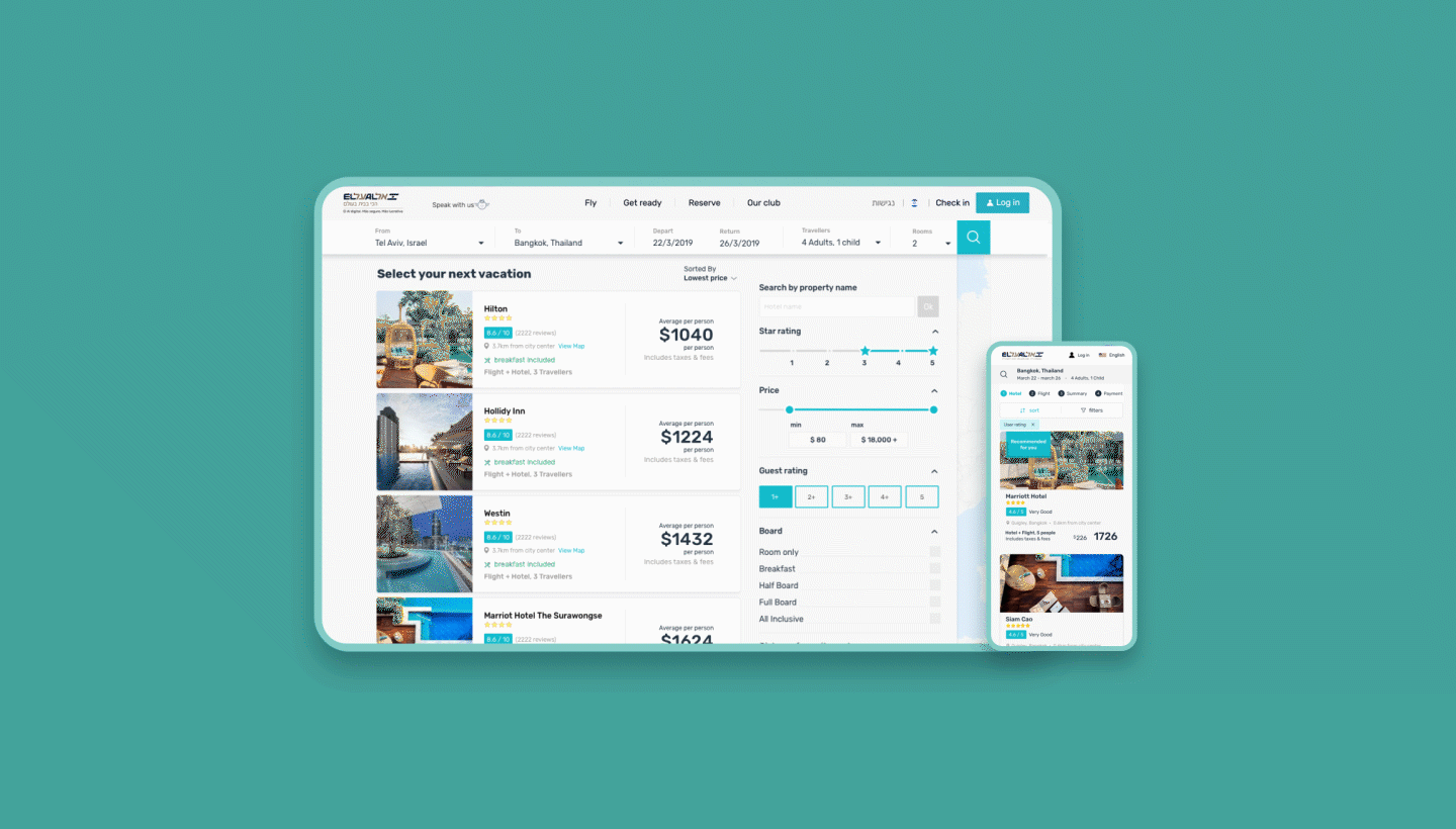
Desktop Process

Orig. Design
Pain points:
Two major CTAs.
Flight information is messy, making it hard to see the relevant details following a quick scan.
When the option- ‘More Flights’- is selected, more flights open in the same page, diverting the user's attention.
Outdated design.

Version #1
This design is one of the first options we offered the airline. We replaced the hotel cards with a square shape to give hotel images more focus and visibility. Since the users of ELAL's online portal are mostly returning conservative costumers, we were asked to design a more conventional layout.

Version #2
Designed following the costumer's wireframe instructions
Pain points:
Two CTAs. When the user selects a vacation, they expect to move on to the next step, which causes frustration when they don't.
Hotel card CTAs and 'More Details' are too close to one another, which might cause mistakes.
The 'Selected Vacation' component is not noticeable enough.
'Selected Vacation’ appears twice and is a waste of expensive space.
Flights' information should be more visible.
There are only two hotel cards above the fold and even less in smaller screens.

Version #3
Designed as an update and improvement to the previous version.
The solutions:
Only one CTA (selecting a deal by clicking on its card).
Selected deals appear only once as a hero picture with all the relevant information.
Hotel details open when you click on the selected deal.
Large and clear flight information.
Total price added, in addition to price per person.
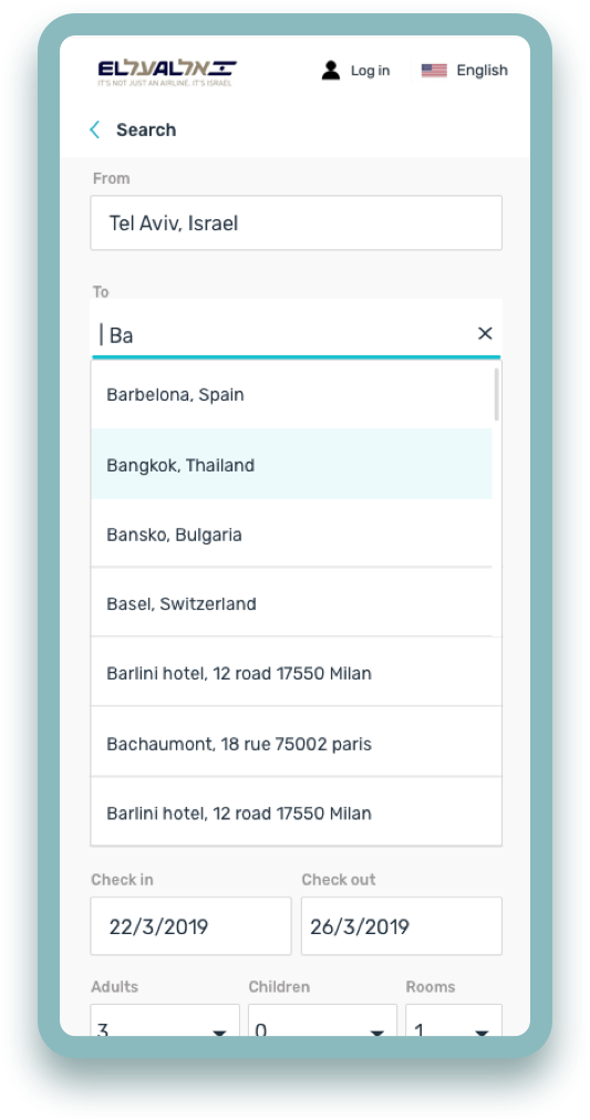
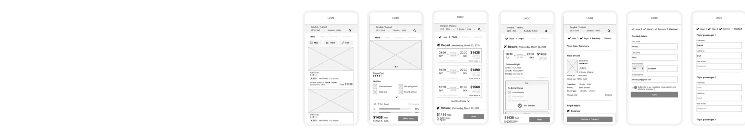
Mobile Process
This project was a ‘desktop first’ project. After ELAL approved the main desktop flow, we started to design the mobile version. I found that a tabs solution would be problematic since each tab contains a lot of information and leaves no room for hotels or flight data. We then decided to use a 'breadcrumbs' approach to give our users a convenient experience, and help them to concentrate on each stem at a time.


After Effects animation & Procreate illustration was created by me
Final Thoughts
This was the first vacation page we built at Bidflyer. Overall, it was a complex process. We faced some restrictions working for a conservative company while wanting to keep the design flexible for use as a future white-label feature.
If I had the opportunity to redesign this feature again, I would opt for a more minimalistic and fresh approach (Hoteltonight/Omio), and make use of approachable illustrations (Google Travel).
Changes that I would make to the existing design:
Replace mobile 'breadcrumbs' to tabs, so it would be more similar to web behavior.
Redesign components of fare families to slider view/tabs for a more seamless experience.