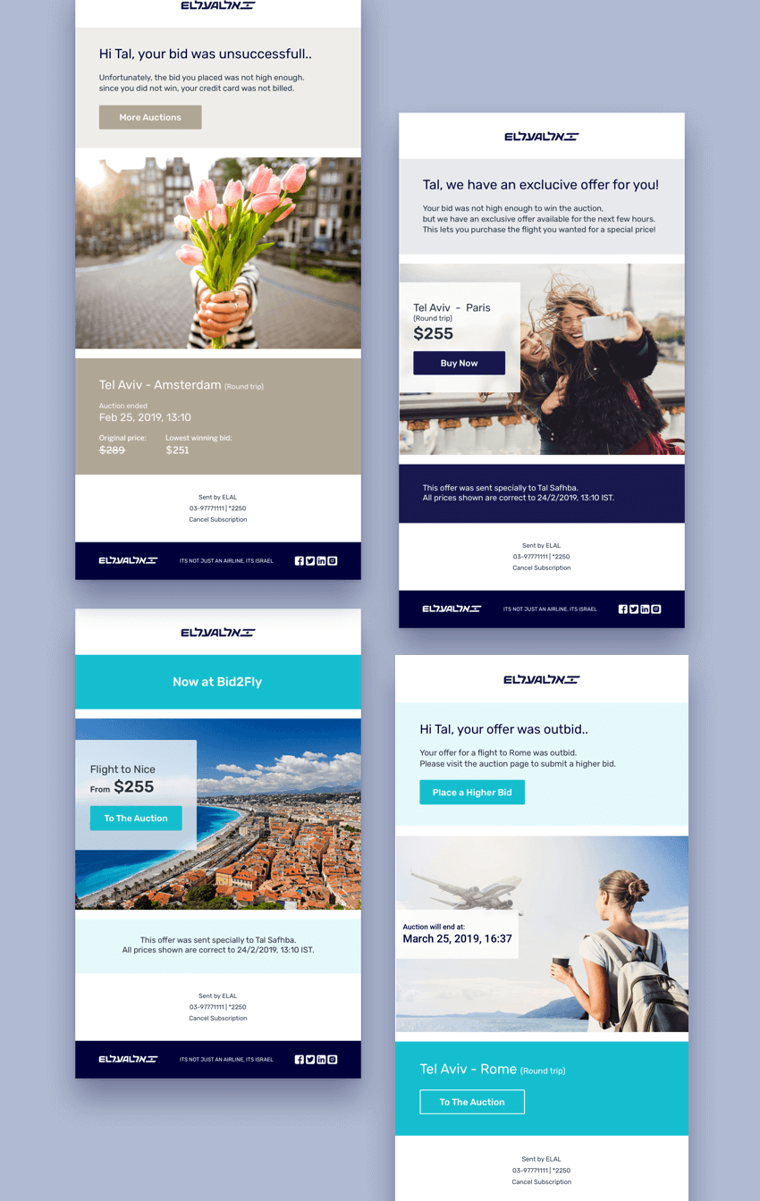
Airline Emails
Keeping customers updated during their bidding efforts to secure the most suitable flight for them by sending personalized emails.

My Role
Research
Sketches
Wireframes
UI Design
Icons
Tools
Sketch
Illustrator
Axure
Invision
Zeplin
Collaborations
I worked closely with our product team and CEO to better understand the business behind the scenes and create the most valuable and effective tools.
Together with our development team, I carried out brainstorming, flow clarifications, QA, etc.
year
2019
Background
As part of its FRP, Bidflyer offers airlines to add a bidding platform that will enable customers to choose their prices, in an attempt to fill up distressed flights. An essential component of the platform is to accompany the customer's bidding process and to inform them on every update or change. The airline communicates with their customers by email. This project was one of my first projects at Bidflyer. It was an excellent opportunity for me to experience the bidding process and the end-user flow from a fresh perspective.
To better understand the purpose of each email, I created a detailed user flow. This made it easier for me to decide on what information will be the most relevant to each message, and how to set the correct hierarchy for helping the user to quickly scan information and make an informed decision.
Research and Inspirations
I adopted a "learn from the best" approach, which lead me to research influential email companies, such as MailChimp. I tried to define the most important values that make their emails so attractive. Microcopy, consistency, and short and simple messages were the most important features I identified from subscribing to many electronic newsletters. I also analyzed some of the most prominent tourism companies, such as Airbnb, realizing the importance of strong, dreamy images, and a clear hierarchy. My background in fashion lead me to explore some high-end fashion brands. I was inspired by color approaches, proportions, and CTA rules.
Design Challenges
One of the main challenges I faced was to create a white-label template that could support a wide range of brands. I had to take into consideration that the design needs to appear effortless, yet, at the same time, should provide each brand with a strong presence. It also needs to be eye-catching and easy to remember by end users. I used symbols, layer styles, and text styles, which made it very easy and fast for me to replace fonts, icons, and images. Some of the emails were sent at a critical point for the end user's purchase process. Therefore, the copy had to be clear and the design approachable and enticing. Post-sale emails had their challenges as well. One glance should be enough for our users to learn all flight information (when, where, baggage allowance, meals, privileges, etc.). At this point, our mission is to make our customers know they made a great deal, and that we are at their disposal.


